While I am in LA attending the Design Bloggers Conference, Michaela of Michaela Noelle Designs will be filling in for me. As you will see from her blog, Michaela is a darling young design student with a great eye for design and fabulous sense of style. She is currently living her dream of becoming a designer. Love it. And I love the advice her grandmother gave her,
 “Dream big. Don't stop at dreaming though; make those dreams come true by working hard with determination and integrity. Learn all you can so you can be great at what you do. But most of all, do what you love and do it with passion.”
Michaela, thanks again for guest blogging. Keep on dreaming - Your future is bright! ~ Cristin
Hi all! I'm Michaela from Michaela Noelle Designs, and I can't tell you how excited I am to be here at Simplified Bee today! I'm an interior design major at Seattle Pacific University and I am totally, head-over-heels, in love with all things design. Originally from California, I'm still trying to adapt to the rain {and all those looks I get when I pull out my Coach umbrella}. I have a special love for the home and what it means to a person and a family. My passion in life is to serve others, and my joy comes from doing so through interior design.
While school is definitely challenging and time consuming, I feel lucky that I'm learning to do something I'm passionate about. Sometimes, I can't believe I'm drawing a furniture plan for homework! I used to draw floor plans on my kids' menus when we'd go out to eat when I was younger. You know... where most kids would play tic-tac-toe or draw their pet, I would be sketching my dream house. My mom even made sure to tell me not to draw any floor plans at dinner before I left for my first date! I guess she was right. That could have been awkward. (:
Today, I'm going to share some insight on one of my favorite topics: color psychology. Color is such a huge part of our lives! Your mood can directly affect your actions; the color shirt you choose to wear in the morning, the can of paint you decide to redo your family room in, and what color you pick out for your latest manicure. It also works the opposite way, as colors have the ability to make you feel a certain way. Let's start from the beginning, shall we?
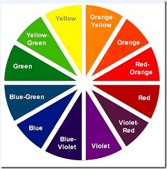
The color wheel:
The hues on the left side of the color wheel are all considered "cool colors" which will make walls recede, or make a room appear bigger, while the right side of the wheel is deemed the "warm colors" which, in turn, make walls or a room advance.
The Joyful Energizer: Yellow
Yellow is refreshing. It adds life to any room, rejuvenating the soul. The pure and bright characteristics of the hue offer energy and happiness. Last year, we discovered that painting a nursery a bright tone of yellow may cause the baby to be too awake and energetic, therefore causing more crying. Silly, but it could be true! Yellow is the brightest color on the color wheel, so your eye will be immediately drawn to something yellow, even if it's surrounded by multiple other colors.
The Bold Show Stopper: Red
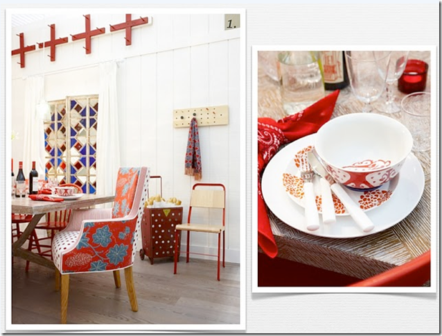
Did you know it's actually proven that when a person walks into a room of red, their heart rate will automatically increase? It gets your blood pumping. Red is the absolute most appetizing color. So serving food on red plates or eating in a room with red walls or accents will actually make someone more hungry {and perhaps enjoy your cooking even more!} Sarah Richardson nailed this dining area with punches of red, warming up the space, while the accents of blue anchor the room. Because red is such a bold color, white or neutral walls with red accents is a great way to introduce the color. It's a show stopper. (:
Purple might be is most definitely my favorite color on the color wheel. Sitting directly opposite of yellow, purple is the perfect color for peacefulness. Since it's character foil is yellow, which personifies energy and makes you want to go-go-go, peace and serenity is only fitting for the personality of purple. It exudes confidence, creativity, and passion. It is also the color of royalty, and who doesn't love feeling like a princess?
The Tranquil Get-Away: Blue
Reminding us of the sea, sky, and rushing rivers, blue will soothe our souls. Because it is a "cool color", it makes walls recede, creating the allusion of a bigger space. The first picture shows how just a subtle sky blue paint can warm up the space, giving depth to the room. The second picture is the perfect example of how to add drama to a space with wonderful architectural features, like the molding. This dark blue adds a dash of formality to a casual family room. Want to know a secret? Blue is the most unappetizing color. In fact, if you ever go to a salad bar or buffet table, a lot of the time the restaurant will strategically give you blue plates. You'll automatically take less food, because you're not as hungry just by looking at the plate! Crafty folks, eh?
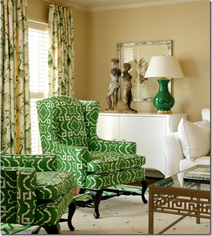
Green is the color of nature. It brings the outdoors in, which is always nice, isn't it? Green is said to bring new life and a sense of freshness to a space. Being on the cool side of the color wheel, it is also a tranquil color. In other avenues of life, we attribute green with money, health, and jealousy. In the home though, it often tends to have a calming effect, much like purple and blue. Did you know guests on TV shows wait in "green rooms" intentionally, so they can de-stress before their appearances? I love how designer Tobi Fairley is bold in her color choice, but not in the expected fashion of the walls. This is a great example of how to make a statement with pieces in the room, not necessarily your wall color. It's a wonderful choice for renters who don't have the option of painting!
The Understated Grace: Neutrals
Just because you chose neutral paint, furniture and accessories doesn't mean you have no personality! You have quite a distinct one, actually. Neutral colors are said to be relaxing, soft, plush, pleasant, graceful, and have a sense of understated elegance. White couches and rugs also say "I'm bold, daring, and luxurious enough to own something white." I happen to be very drawn to neutral spaces, with perhaps a touch of color in the rug, pillows, or flowers. One tip- when trying to achieve this look, be sure to include more texture in your space. Texture is what makes neutral rooms shine, as seen in the beautiful fireplace above!
For today's sake, we are calling black a color (even though it is technically the absence of color, but obviously that's no fun!). "Every room needs a touch of black"...I remember hearing this on HGTV once, and I really like the saying. Black anchors a room, and it's another bold choice when used on walls and in cabinetry, as seen above. It's the color of mystery and sophistication. Black is commonly seen paired with a contrasting color. Putting any color against black will consequently make the other color appear brighter. In both photos above, you can see how even though there is black in the spaces, they are still ever so lovely and glamorous when paired with textures, complimenting patterns and lighter colors to balance the black.
Thank you so much, Cristin, for having me share some insight from my classes in design school. You're the sweetest and I can't wait to meet you in person someday!
And readers, it's been fun! I hope this post has brightened your knowledge on color as much as it brightened my day to bring it to you. (:
~Michaela


Excellent post! Thanks for sharing with us Michaela and have fun Cristin!
ReplyDeletepve
Lovely post Michaela!! I adore the rooms you picked (Sarah Richardson is one of my faves!) and your thoughts on every colour :)
ReplyDeleteWonderful post!! I love learning about colors. We have black in our bedroom and I love it. Some people think it's weird to use black, but we paired it with gold and it's fabulous!! : )
ReplyDeleteOh, very interesting! My kitchen is a great yellow, living room is a soft gray and all my accents are lime/green! I like my choices and your description and details regarding each color. Thanks for sharing!
ReplyDeleteKristy
Thank you so much for having me today, Cristin! Enjoy your blogging conference (:
ReplyDeleteLove that idea for the headboard! And love all the bold colors! :)
ReplyDeleteMichaela is such a talented interior designer with an eye for the most exquisite of designs :) I adore her style and adore her as a friend even more. What a fabulous post she has put together here!! Def useful for people like me who don't know a whole lot about colours!!! xo
ReplyDeleteGreat Color Psychology post!!! I'm right there beside you on purple!! It is magical, right?!
ReplyDeleteGood stuff. Thanks, Michaela. I am currently deciding between yellow and purple as an accent color in my bedroom. Two very different feels...
ReplyDeleteOh, wish I was at the conference! Enjoy your time there and what an enjoyable post! Janell
ReplyDeleteI remember writing an essay on this topic for my Psychology class! It's interesting when you notice how many fast food chains choose yellow and orange in their signs/decor. It makes you wanna be impulsive, and EAT quickly, making room for the next people.
ReplyDeletehttp://bottleblack.blogspot.com
Great info Michaela, you will make a wonderful designer!
ReplyDeleteThis was a fun and very interesting and helpful post on color. I enjoyed it! Lots of good info. Thanks, Michaela. Have fun at your conference Cristin.
ReplyDeletehttps://webmail.west.cox.net/do/mail/message/view?msgId=INBOXDELIM79910
ReplyDeleteCristin, I was as the conference and heard your questions to the panel regarding the above topic, and, coincidentally, this article was in my inbox. Thought it might be helpful.
Cristin, sent the wrong link above...check out WM Freelance Writers Connection article on preventing "scraping" by Angela Atkinson. It might be helpful. Sorry we did not meet at the conference but hope you enjoyed it as much as I did.
ReplyDeleteLove the purple - gorgeous so modern and so sumptious..
ReplyDeleteThank you again Michaela for a wonderful article!
ReplyDeleteDiane, thank you too for the information.
xo,
cristin
Thanks for the great, simple breakdown of colors! Super helpful post that could help make color choices so much easier!
ReplyDelete